
Analyse results and track progress
Step 1: See submissions arrive
After a client submits, your session row updates:
-
Submissions count increases
-
Last submission shows “Just now” (or similar)
-
Recent score displays the latest score
If you have multiple check-ins, you’ll see the last few scores and a trend arrow (e.g., improving).

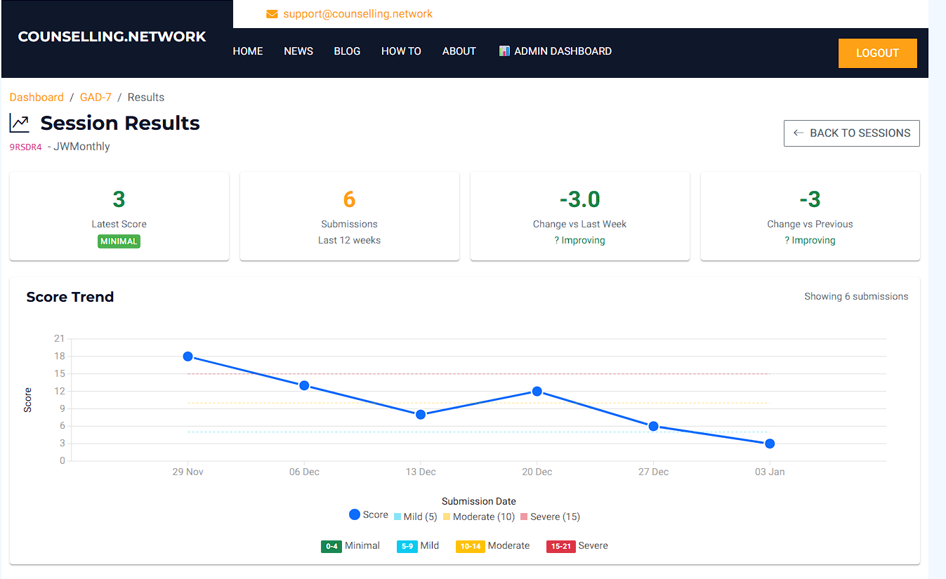
Step 2: Open Session Results
Click the Results action for the session.
At the top you’ll see summary cards such as:
-
Latest Score (with severity label)
-
Submissions (last 12 weeks)
-
Change vs last week
-
Change vs previous
These are designed for quick interpretation.
Step 3: Score Trend (line chart)
The Score Trend chart shows:
-
Each dot = one completed submission
-
The line shows how scores change over time
-
Severity ranges are shown as bands:
-
0–4 Minimal
-
5–9 Mild
-
10–14 Moderate
-
15–21 Severe
-
This is the best view for spotting steady improvement across weeks.
Step 4: Question Breakdown (radar chart)
This section helps you understand which questions are changing, not just the total score.
How the radar chart works (simple)
-
Each spoke (Q1–Q7) is one question.
-
The centre = 0 (“Not at all”)
-
The outer edge = 3 (“Nearly every day”)
So:
-
Shapes closer to the centre = fewer symptoms
-
Shapes closer to the edge = more frequent symptoms
Compare different submissions
Use the dropdown (e.g. Last 5 submissions) to switch to Last 10 submissions if you want to compare more.
You can also click items in the legend to hide/show individual submissions, which makes it easy to compare:
-
First vs latest
-
Last month only
-
Two specific dates
Question scores table
Next to the radar chart is a table showing:
-
Per-question scores (0–3) for each submission
-
Total score per submission at the bottom
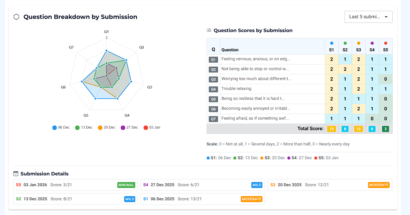
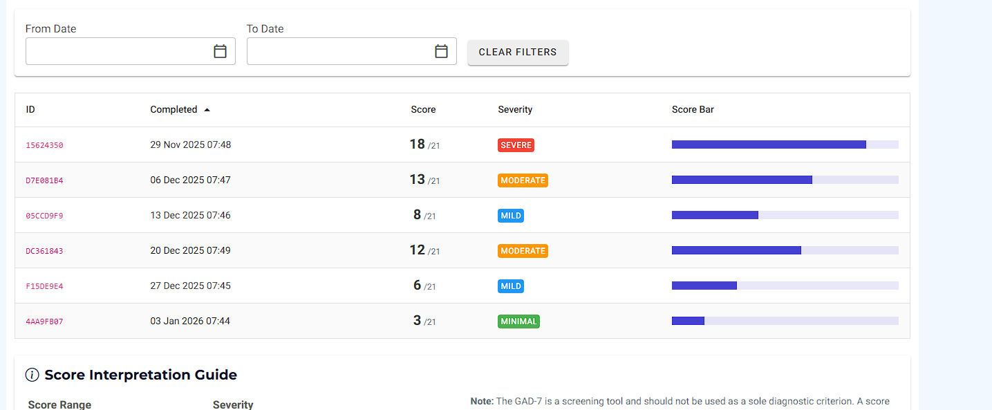
Step 5: Submission Details and the submissions list
Under the charts you’ll see submission cards with:
-
Date
-
Score (out of 21)
-
Severity
Further down, the submissions table lets you:
-
Sort by Completed date
-
Filter by From / To date range
-
See severity and a visual score bar
This is ideal when you need the exact numbers for a specific week.
Developed by Spitzer, Kroenke, Williams, and Löwe.”